Brand patterns
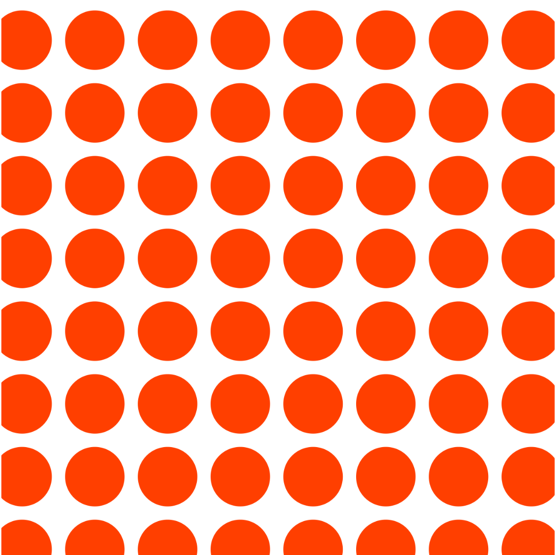
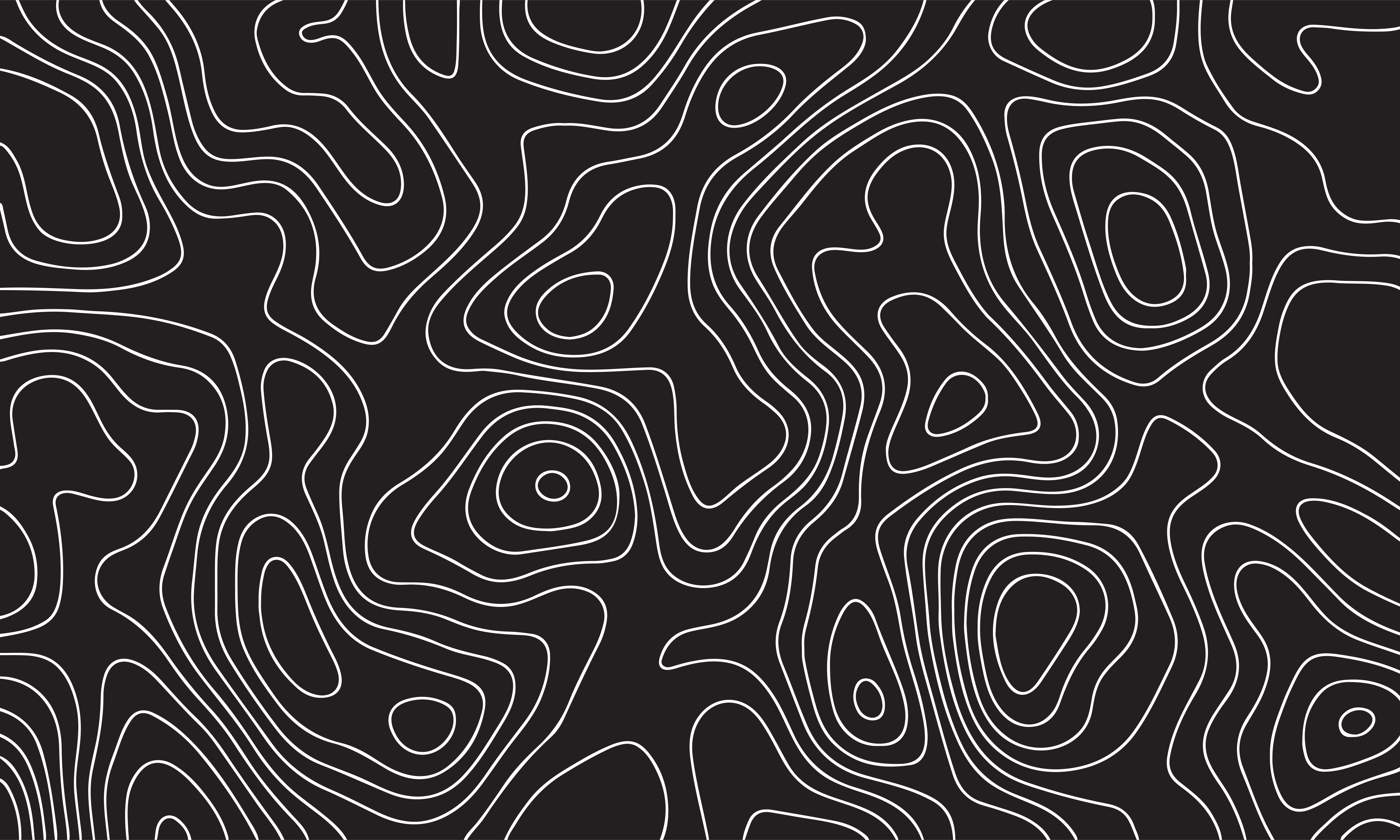
The patterns add energy, movement and personality. Drawn from the logo and the mountain environment, they form a flexible system that adds vibrancy, texture and interest in digital and print.
The sun can be repeated, resized and rearranged into bold, playful patterns. The flowing mountain silhouette becomes a dynamic step-and-repeat that captures the rhythm of the slopes. Topographic contour lines connect to maps, terrain and navigation, reinforcing Lifty's purpose as a mountain guide. Together they make a visual language that is adventurous, expressive and unmistakably Lifty.

Using patterns
Patterns are texture, not content. A surface reads well when it has one pattern, one motif and one place for text, each in its own corner. The rules below come from how the apps already draw them, so a card in the app and a page here look like pieces of the same map.
One pattern per surface
Pick contours, the mountain line or dots. Mixing them turns texture into noise. A surface may also carry no pattern at all.
Contours fill the whole surface
Contour lines are a map, and a map doesn't stop halfway across the page. They always run edge to edge, with these rules:
- One zoom. Every surface shows the lines at the same scale (about 23 px apart on screen), so cards, headers and posters read as parts of one terrain. Never scale the sheet up or down to fit.
- A fixed piece per surface. Each surface is cut from the same contour sheet with a stable name (for example
band-colour) that chooses which summit it centres on and how the sheet is turned. The same surface always shows the same terrain; never tile the sheet or cut a random piece each time. - Summit in a corner, text in the clear. The summit (the innermost rings) sits near the top-right corner. The lines are strongest there and fade to a third of their strength at the far edge, so text on the other side stays easy to read.
- Thin, single colour. One palette colour at a low opacity; never two colours, never thick strokes.
The mountain line is zoomed in
The mountain line is the mark repeated at an angle. Zoom it in until no end of any mark is visible inside the surface: it should read as broad, flowing bands, not as a row of logos. Like contours, it fills the surface edge to edge, in one palette colour at a low opacity, so it sits behind everything else.
Dots are a cluster, not wallpaper
Dots are the sun repeated, so they behave like a graphic, not a texture:
- One cluster per surface: a short grid (five across, three down) hanging off one corner and cropped by both edges, never a field across the whole surface.
- Even rhythm. Each disc is about 82% of the spacing between them (42 to 51), the same everywhere, so the gaps read as deliberately as the dots.
- Full strength, one colour. Orange on Deep Burgundy, burgundy on orange, as in the guidelines. Dots don't fade; they are either there or not.
- Never behind text. The cluster sits in the corner away from the words.
One motif
The big sun and the cropped mark are each a hero: give a surface one of them, in the corner opposite the text (bottom-right for left-aligned text). The pattern gathers in the top corner, the motif in the bottom one.
- The sun never joins dots. The dots are suns already; a big sun beside them reads as one dot too many. Pair the sun with contours, the mountain line or nothing.
- The mark can be enlarged and cropped by two edges at once. It never overlaps text and is never rotated or two-toned.
- Small surfaces drop the motif. If a card is too small to keep the pattern and the motif in separate corners, leave the motif out — a crowded corner is worse than a quiet one.
Stickers
The icon stickers draw on the mountains, adventure and the Lifty visual language. They bring the brand to life simply and recognisably across the app, social content, merchandise and marketing.
Each sticker uses key brand elements — the mountain silhouette, the sun, trees and topographic lines — in the bold palette. The circular format gives them a friendly, collectible feel, good for highlighting features, making icons or adding flair. Sticker set examples: the mark under a sun inside a teal circle with an orange ring; a white tree on an orange circle; contour lines in an orange disc; lifty and www.lifty.ski as outlined type stickers; "YOUR MOUNTAIN PLAYGROUND." in Jorude on an orange outline.
Sticker artwork files are not in the delivered package yet.
Alternative assets
These extend the identity beyond the logo with more personality and creative freedom. The sun becomes a bold circular graphic that can be resized, cropped and used in unexpected ways. Expressive typography, oversized letterforms and sticker-style graphics add fun and individuality — for example ift cropped huge in Electric Orange on Deep Burgundy, or "JUST FOLLOW THE SNOW." in Jorude on Icy Mint. Experiment with scale, placement, colour and playful text arrangements, while keeping Lifty consistent and recognisable.