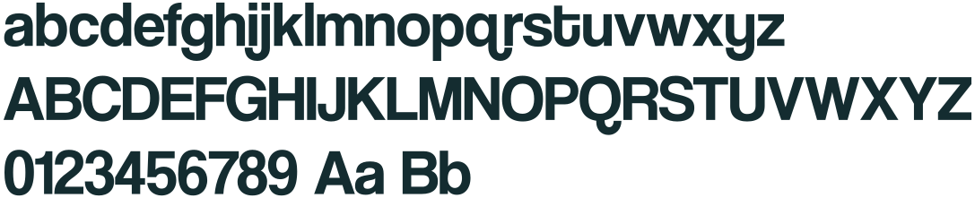
Primary typeface: Coolvetica
Coolvetica is Lifty's primary typeface, chosen for its bold, chunky letterforms and playful personality. Rounded curves and soft edges make it friendly and inviting; its strong, confident structure keeps the brand modern, impactful and easy to recognise.
It makes a statement without giving up legibility, bringing energy and character to headlines and display type. It complements the flowing logo and the brand's adventurous spirit: fun and functional, clean and professional.
Use for: display, headings.

Decorative typeface: Jorude
Jorude brings a rugged, adventurous edge. Its bold, irregular letterforms and textured look draw on the raw, untamed outdoors, adding movement, character and individuality.
Used for expressive headlines and playful moments, Jorude contrasts with the softer, rounded Coolvetica. It adds personality and outdoor spirit and keeps the brand energetic, youthful and a little unexpected.
Use for: expressive headlines, taglines, stickers.



Body copy: Poppins
Poppins is the supporting typeface, chosen for its clean, rounded letterforms and friendly feel. Its modern, geometric design complements the brand's playful personality while staying very legible — ideal for body copy, app navigation, information and everyday communication.
A wide range of weights gives the flexibility for clear hierarchy in digital and print. Its simplicity balances the bolder display faces and keeps Lifty's communication consistent, accessible and easy to navigate.
Use for: body, information, paragraphs, labels.
Poppins
abcdefghijklmnopqrstuvwxyz
ABCDEFGHIJKLMNOPQRSTUVWXYZ
0123456789!?@£><
Light 300Aa Bb Cc
Regular 400Aa Bb Cc
Medium 500Aa Bb Cc
Bold 700Aa Bb Cc
Type size relationship
With all three typefaces in one layout, keep a clear hierarchy: a subheadline is no larger than 33% of the headline's ascender height, and body copy is no larger than 50% of the subheadline's cap height.

Lifty shows you the way: which lift, which piste, how long. It works offline, all day, wherever the signal gives up.
- Coolvetica
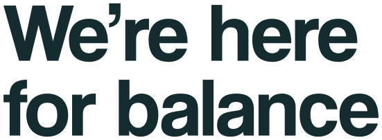
- Headline
- Poppins
- Body copy
- Poppins Bold
- Label
The display face should never be overused or run to many words. The subheading face does the heavy lifting on subheads, and the body face handles small, medium and large bodies of text.
Display leading and tracking
Spacing makes or breaks a headline. Leading is the space between lines; tracking is the space between letters. Coolvetica headlines are set tight: lines close together and letters at their default spacing, so a two-line headline reads as one shape. Too-open leading splits it into separate lines; extra tracking makes it look loose and unsightly.
Exact values are still to come from the designer — see open items.
Fonts on screens
Poppins is free (SIL Open Font License) and self-hosted on this site. Coolvetica's licence covers static use only — print, images, merchandise — so until web and app licences are bought, this site shows Coolvetica and Jorude as outlined images, and products use Poppins in their place.