The logomark
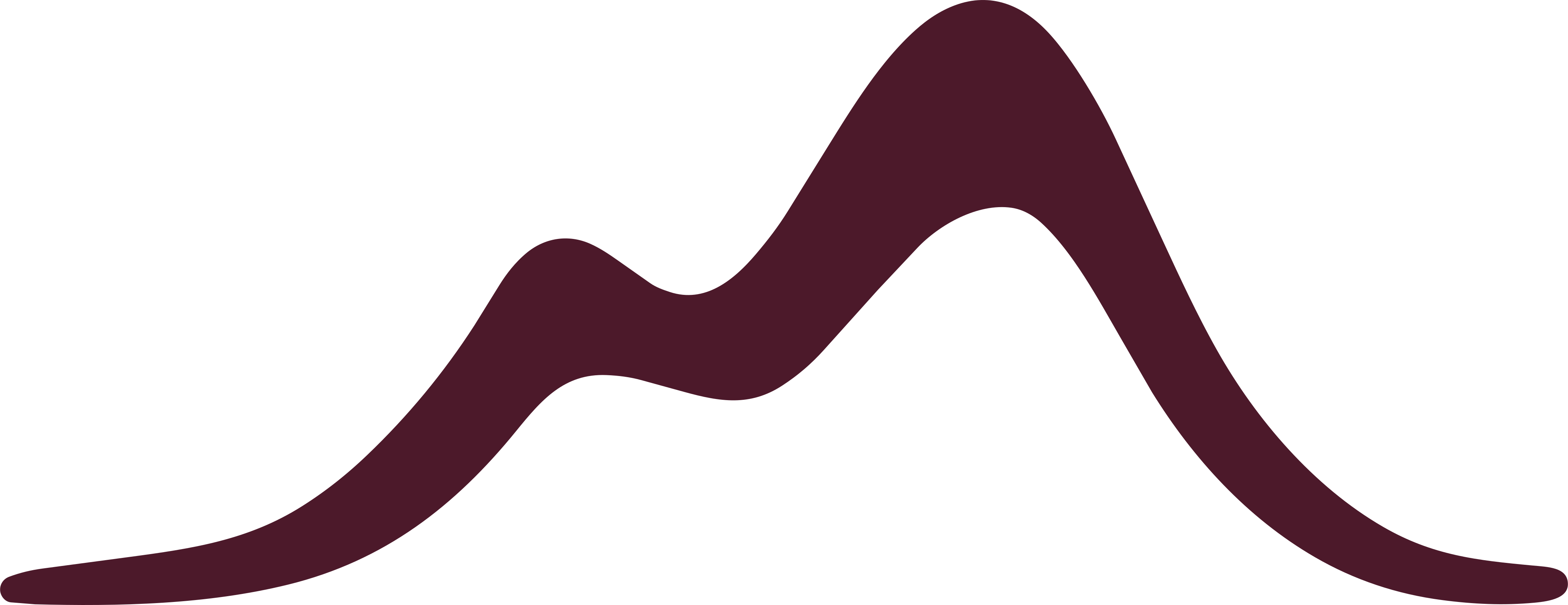
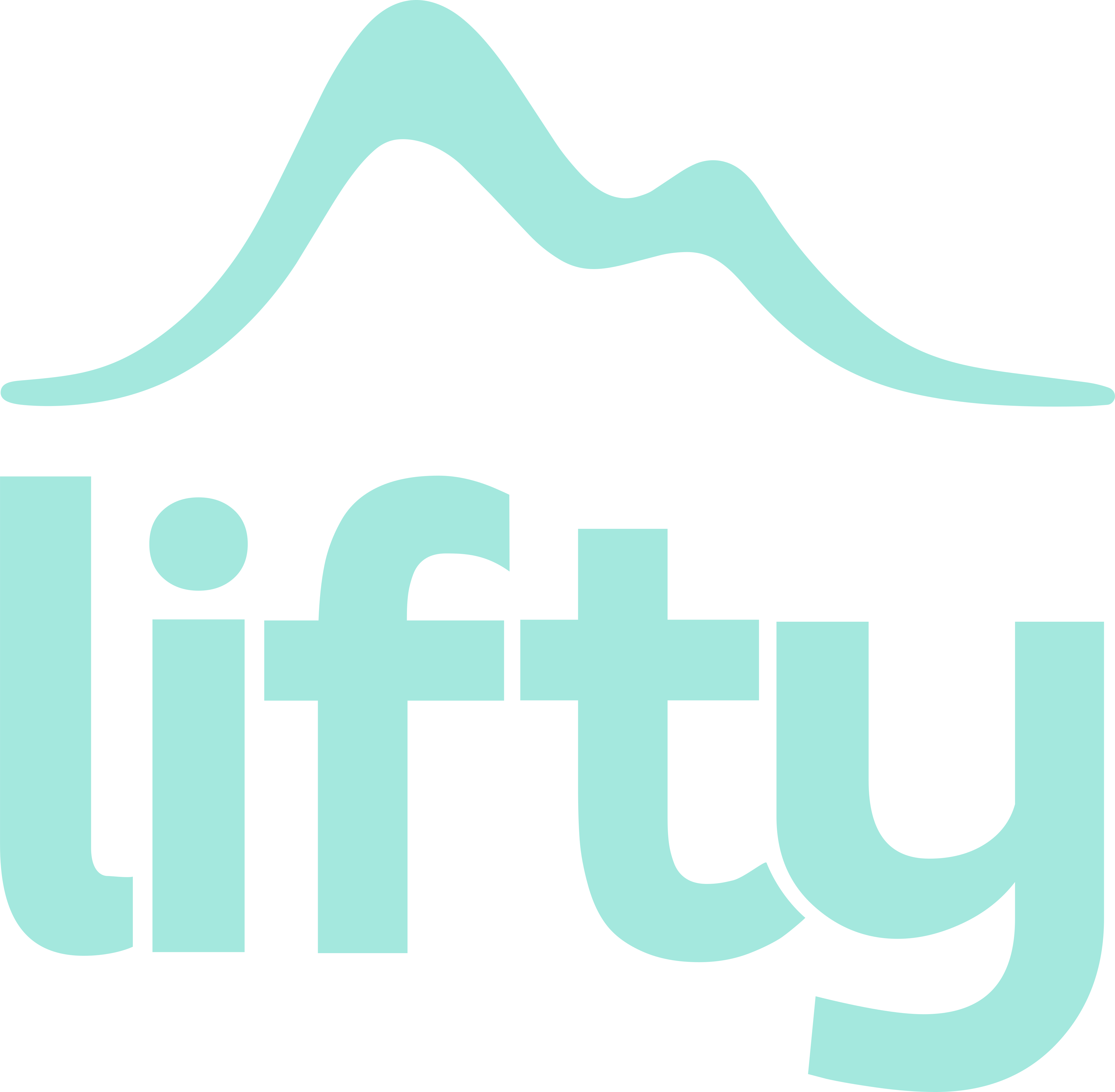
Inspired by the mountains and designed for movement, the mark takes a playful approach to the traditional mountain silhouette. Instead of sharp peaks and rigid shapes, soft flowing curves reflect the natural rhythm of the slopes and the freedom of skiing and snowboarding.
The organic form brings movement, adventure and personality: approachable to beginners, exciting to experienced riders. It is bold yet minimal — playful and professional — so it stays recognisable and works across digital platforms.
The two uneven peaks give it a natural rhythm rather than a balanced, corporate look. The rising and falling line also suggests a journey across mountain terrain, which ties it to Lifty's purpose: navigation.


The wordmark
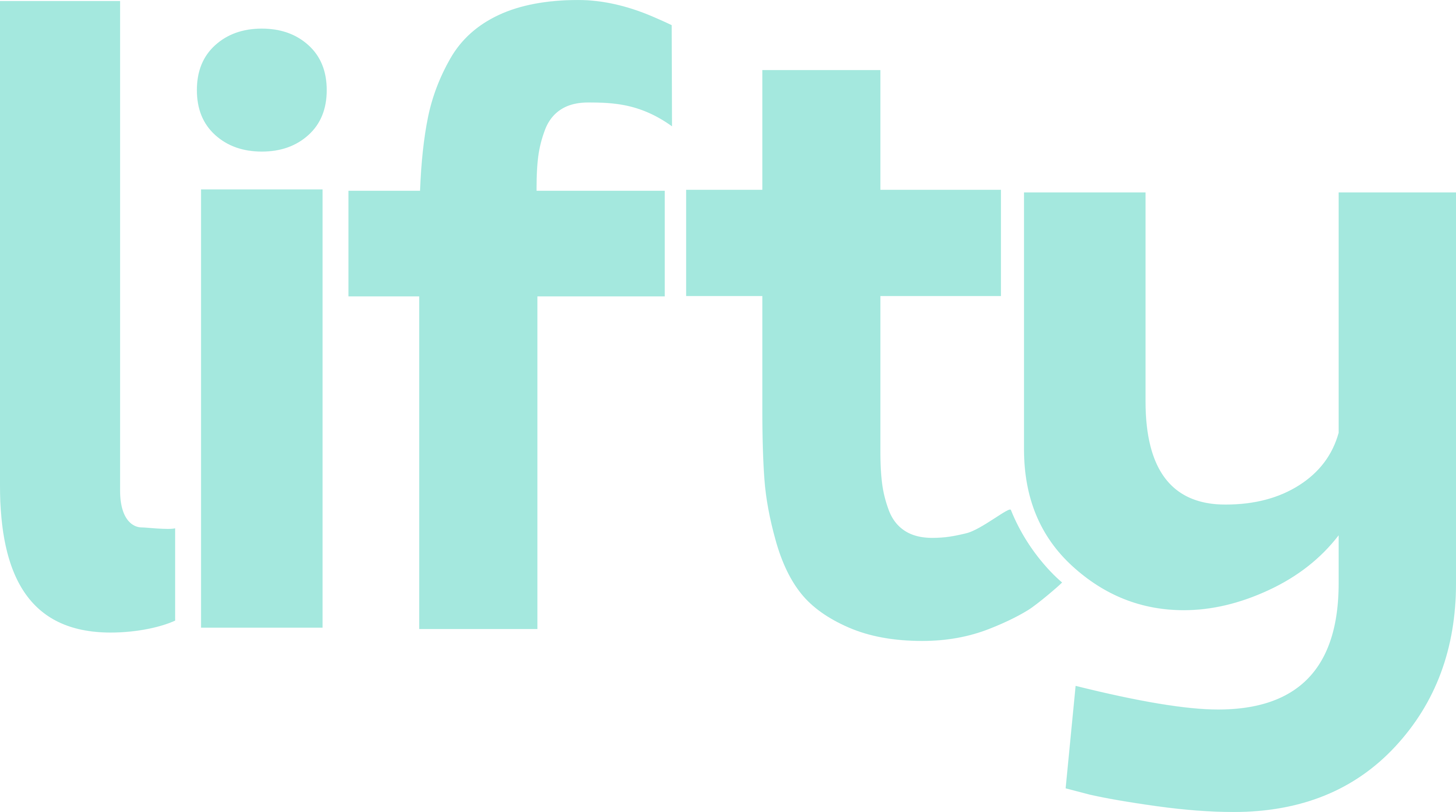
The wordmark is bold, playful and full of personality. Chunky letterforms, rounded edges and subtle curves make it friendly and approachable — a move away from the rigid, technical type of most outdoor brands.
The custom lettering adds movement and individuality and complements the fluid mark. Its strong, clean silhouette keeps it readable and recognisable on every platform: youthful energy, balanced with function and professionalism.


Logo lockup
The full logo brings the mark and the wordmark together: organic curves and strong letterforms that feel energetic and balanced while staying clean and professional.
The lockup can be used with or without the sun. The sun adds warmth, optimism and playfulness; the simpler version keeps a strong identity on both digital and physical touchpoints.


Secondary logos
The landscape logo is a compact horizontal alternative for layouts where the stacked lockup doesn't fit.
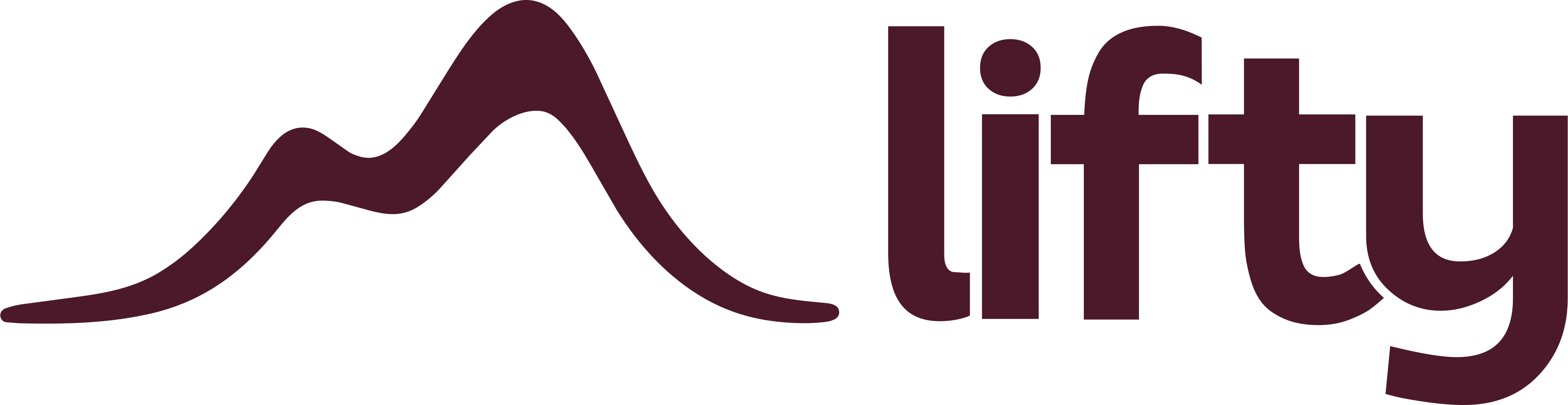
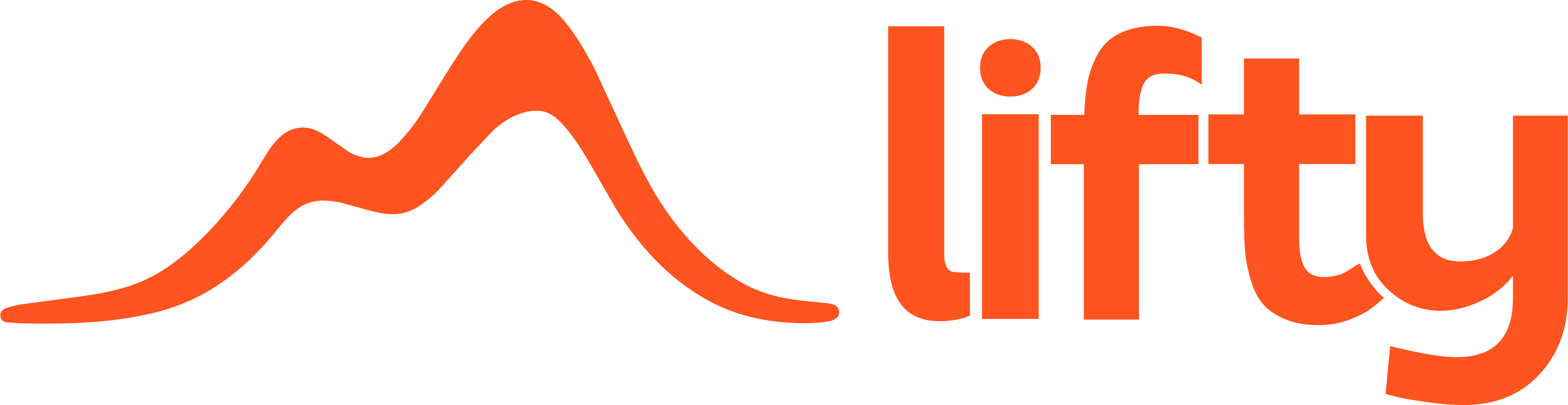

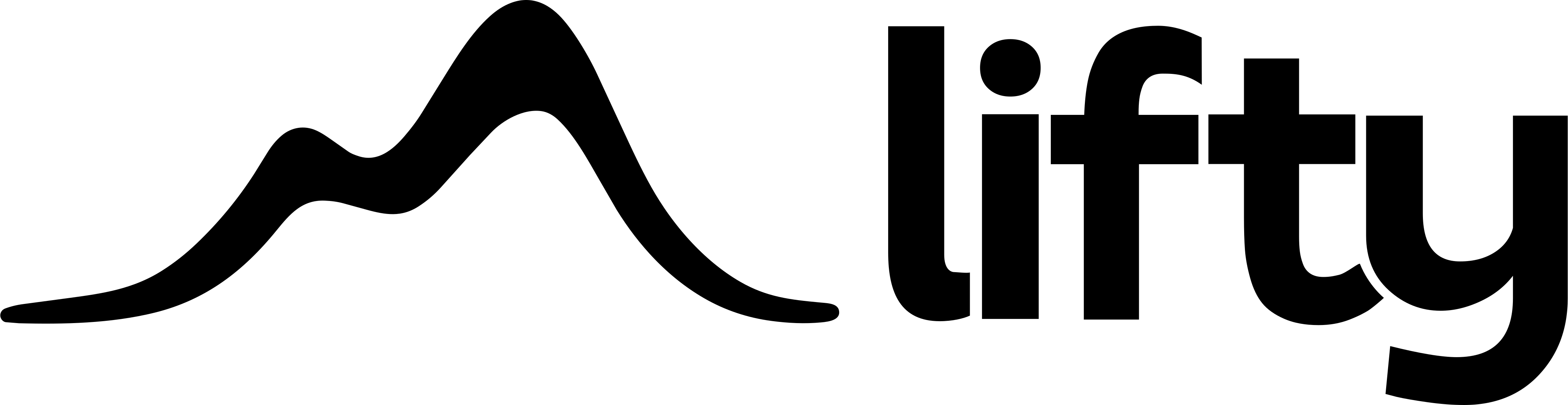

The sun adds a layer of playfulness and creative freedom. Its colour, size and placement can change — behind the lockup in Icy Mint, for example — so the brand feels fresh without losing consistency.
Logo colours
Logos are coloured only in the primary colours: Mountain Teal, Electric Orange, Deep Burgundy and Icy Mint. Where the logo absolutely cannot be printed in brand colour, or for accessibility in digital use, black and white may be used. The tiles above show each colour on the background it is made for:
| Logo colour | Background |
|---|---|
| Icy Mint | Mountain Teal |
| Deep Burgundy | Electric Orange |
| Electric Orange | Deep Burgundy |
| Mountain Teal | Icy Mint |
| White | Black |
| Black | White |
Clear space and co-branding
Keep clear space around the logo so it is never crowded. With a partner, duplicate the clear space and place it between the two logos: the gap between Lifty and a co-brand is double the logo's own clear space. Both the wordmark and the mark can be co-branded, as lifty × Partner.
The clear-space unit ("X") and minimum sizes are not yet defined — see open items.
Placement
Where the logo sits on a digital or printed canvas. Include it wherever is best for your design — this isn't a one-size-fits-all rule.
Misuse
Don't misinterpret, modify or add to the logo. Its orientation, colour and composition stay as shown here. These rules apply to every form: mark, wordmark, lockup and landscape. The examples are the likeliest mistakes, not an exhaustive list.